The year 1960 marked a turning point for professional sports in Minnesota. With the Minneapolis Lakers’ last game in 1960 came the end of city branding in our state. Out were the names Minneapolis and St. Paul, and in came teams with a statewide moniker: the Twins, Vikings, Timberwolves, and Wild. Other than the rogue St. Paul Saints – until recently an independent club – there aren’t any major sports teams that use city names.
In the grand scheme, it’s not a big deal, but in an era where the scapegoating of “Minneapolis” forms a toxic urban-rural divide, it’s always bothered me that our sports franchises do so little to embrace their home cities. Sports serve as another part of a general Minnesotan allergy toward city branding: how come Iowa has a license plate with a skyline on it but we don’t?
The origins of urban erasure
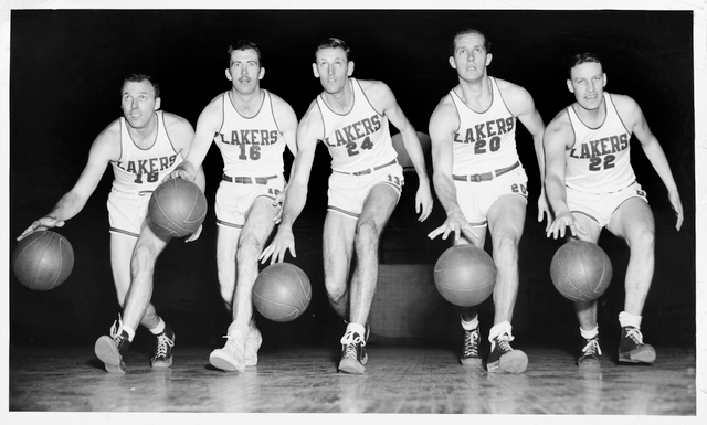
The end of city branding began in a 1950s Bloomington cornfield, when the Metropolitan Sports Area Commission, a partnership between Minneapolis and Bloomington, built a speculative baseball diamond meant to lure an east coast franchise to the then fast-growing Twin Cities metro area. It worked, and Washington Senators owner Calvin Griffith brought his baseball team to Minnesota in 1961, soon joined by the brand-new Minnesota Vikings franchise. The arrival of the Twins signaled the end for both the Minneapolis Millers and the St. Paul Saints, who had been rivals in the American Association since the early 20th century.
With the annexation of the Millers and Saints, the branding of the Minnesota Twins required a delicate subsumption of city identities into a larger geography. Thus the appearance of the two oversized ballplayers, Minnie and Paul, shaking hands across the river, who until very recently stood high atop center field scoreboard. Similarly, though never spelled out, the distinctive “TC” hat implicitly stood for “Twin Cities.” According to the indispensable uniform history blog, MLBCollectors.com, putting an ‘M’ on their hat would have been read as saying ‘Minneapolis’, and needed to be avoided to maintain geographic neutrality.
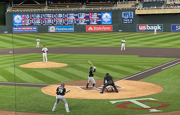
When the team finally moved back to Minneapolis at its indoor metrodome location, it might as well have been Elk River for all the views of the city skyline you could see. It wasn’t until the 1987 rebrand that the franchise felt comfortable enough to add an ‘M’ logo. Only with the construction of Target Field in 2010, did the actual city of Minneapolis make an appearance, with the west side of the skyline and and stadium entrances seamlessly integrated into the North Loop and Warehouse District neighborhoods.

For the next two seasons, the sign stood out like a sore thumb in a state where regional branding has long been the default mode. A sign like that would have been commonplace in cities like Chicago or Boston — see David Ortiz’s famous “Our city” speech — the sentiment ran against the broader anti-urban currents that are common in Minnesota.
Where’s the “city” in city edition?
Another example: the Minnesota Timberwolves have been committing years-long malpractice with their “city edition” uniforms. Since 2017, in partnership with Nike, each NBA team has released a collectible alternative jersey that they wear a few times per season. According to the original launch, the city editions “represent insights and emotion from the court to … the cities’ streets”.
In practice, this means that NBA teams amp up their city branding. New Orleans becomes NOLA; streets like MLK (Atlanta); nicknames like The Land (Cleveland) or Cream City (Milwaukee); and even state-branded teams like Golden State become Oakland or The Bay. Most notably, the Brooklyn Nets, already named after a New York City borough, released a “Bed-Stuy” jersey, diving down into the specific Brooklyn neighborhood where the stadium is located.
With their annual release of a new “city edition” designs, each year the Timberwolves miss another golden opportunity to, you know, mention their city in any way. The Wolves have put MINN and MSP on their jersey, but made no mention of Minneapolis. Across the entire league, it’s rare that a city edition avoids so neglects its city; only Utah and Indiana have kept their state names, and your guess is as good as mine about those teams.
Hope for the Twin Cities
Still there’s hope. On Friday at the Mall of America, just a few feet from the original Metropolitan Stadium home plate, the Minnesota Twins released an ambitious rebranding that kept the retro TC logo (returning to the flat, sans-serif ‘T’ of yore) along with an all-new M hat. (My short take is that I like them, and am glad to see the end of the odious Kasota Gold trim.)
It’s a start. Maybe the Twins will rub off on their neighbors in nextdoor Target Center. I’m holding out hope that, one day, the Timberwolves release a city edition that is actually contented to the city they play in, Minneapolis Minnesota, the largest city in the state. MPLS fits perfectly on an NBA jersey. If they do, I guarantee that it’ll sell like hotcakes.


0 Commentaires